Every entity selling a product, service, image, or idea to the public has a brand. We tend to use the term “brand” for companies, but this marketing concept also applies to people (personal branding) and to places (city branding, country branding, and so on). Since London is one of the most visited cities in the world, its city brand is obviously a very powerful one and features elements that are easy to recognize. Anyone who is familiar with western culture has heard about Big Ben or the London tube – this article will provide some more information about these symbols and, why not, selling points of the capital of the UK:
-
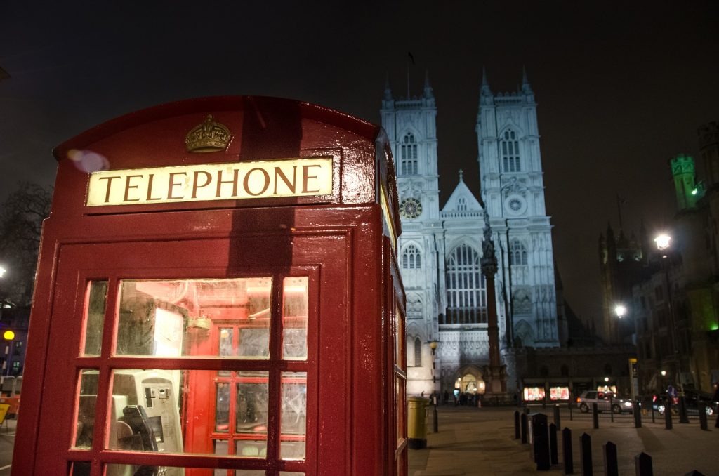
The red telephone box
Little people use the public telephone these days, but the red telephone box is so iconic that when we see it we immediately associate it with London. However, these telephone kiosks are a familiar sight on the streets of the entire United Kingdom and are also used in Malta, Bermuda, and Gibraltar. The red telephone box was designed by Sir Giles Gilbert Scott and the red color was chosen because it makes the kiosks easy to spot. Their number has been decreased in recent years, but they continue to be used because London streets would not be the same without the currant red boxes.
-
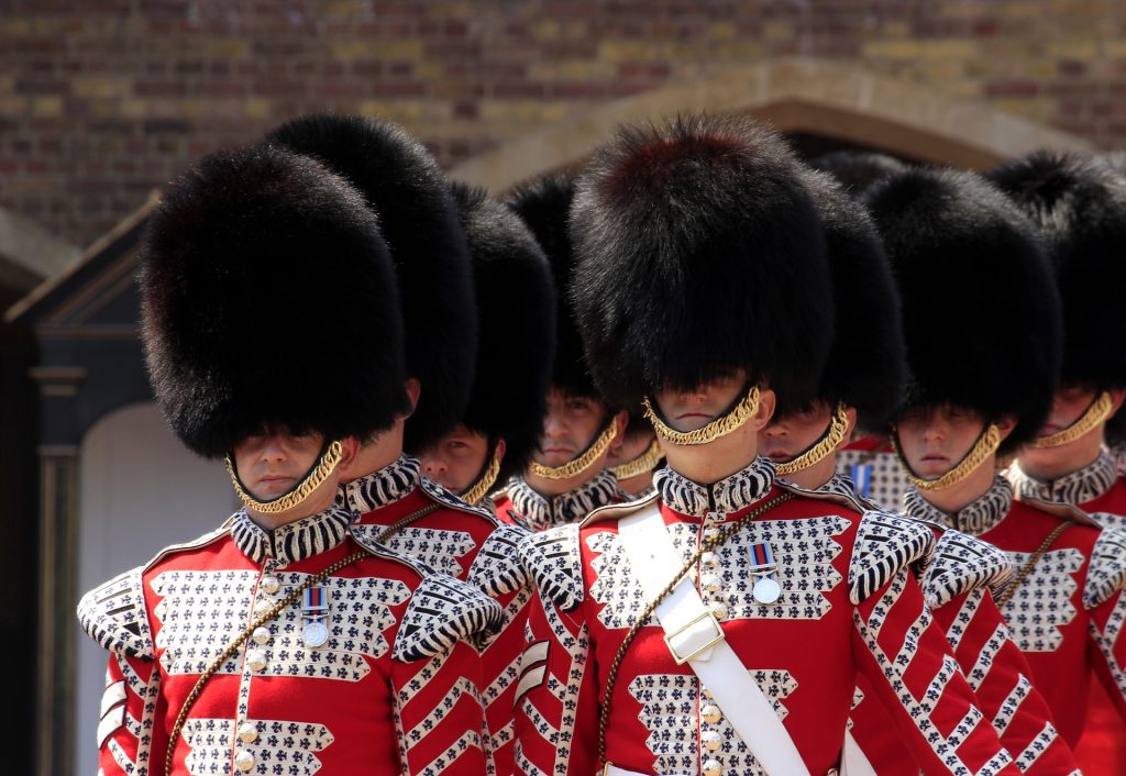
The bearskin hat
Another iconic image of London is the Queen’s Guard, with its silent and unsmiling soldiers wearing tall fur hats. They are actually called bearskin hats, a type of ceremonial military hat dating back to the 17th century. The hats are indeed made from bearskin – the material is obtained from the skin of American black bears, taken annually during the Black Bear Cull in Canada. The British Army takes 100 skins every year, apparently a small part of the bears killed to keep numbers in check. As you expect, there have been numerous protests from animal rights organizations asking to end the practice for being cruel and outdated, but the British Army has not given up due to the natural properties of the bear fur which are not matched by synthetic materials, such as the ability to repel moisture in wet conditions.
-
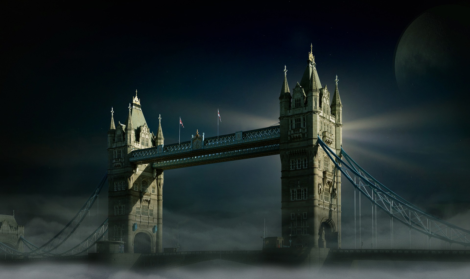
The Tower Bridge
One of the iconic symbols of London is represented by Tower Bridge, crossing the River Thames close to the Tower of London. It consists of two bridge towers tied together at the upper level by two horizontal walkways and is painted in blue and white. The bridge was built between 1886 and 1894 and its bridge deck is freely accessible to vehicles and pedestrians – it is crossed by over 40,000 people every day. The towers, however, are part of the Tower Bridge exhibition and can be visited by paying an admission charge. Renovation work was completed between 2008 and 2012 costing £4 million and for almost three months in late 2016 the bridge had structural maintenance work performed on it.
-
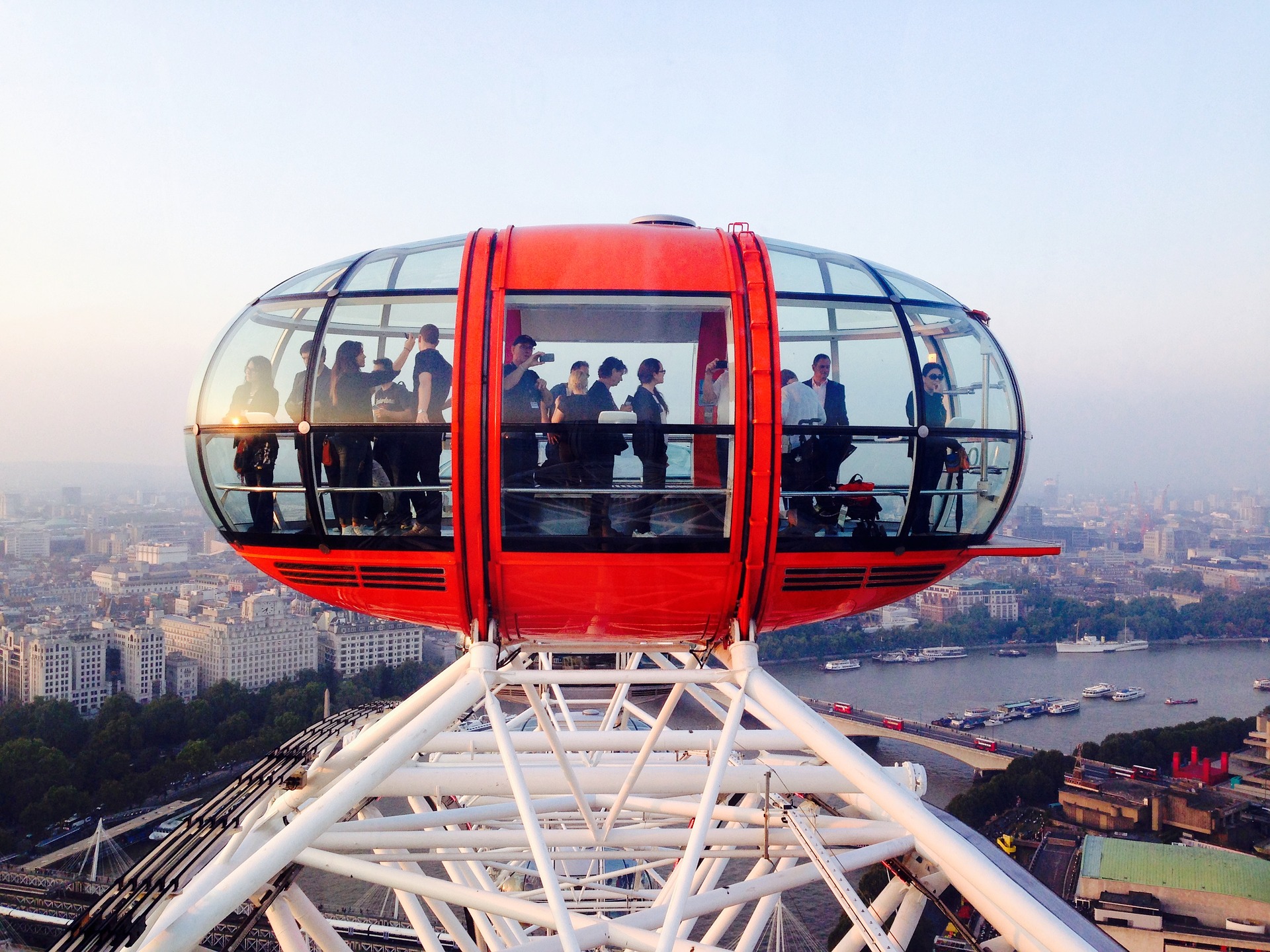
The London Eye
The London Eye is a newer attraction, opened to the public in 2000, and it managed to become extremely popular in a short time. At the time of its opening it was the world’s tallest Ferris wheel and it now offers the second highest public viewing point in London. 3.75 million tourists visit it every year and admire the city from its 32 sealed and air-conditioned capsules holding up to 25 people. The wheel doesn’t stop to take passengers, as the rotation rate is slow enough to allow passengers to walk on and off the moving capsules at ground level (except for stops allowing disabled and elderly passengers to embark and disembark safely). The London Eye was met with positive critical reception – this is the opinion of Sir Richard Rogers, winner of the 2007 Pritzker Architecture Prize: “The Eye has done for London what the Eiffel Tower did for Paris, which is to give it a symbol and to let people climb above the city and look back down on it. Not just specialists or rich people, but everybody. That’s the beauty of it: it is public and accessible, and it is in a great position at the heart of London.”
-
The London bus
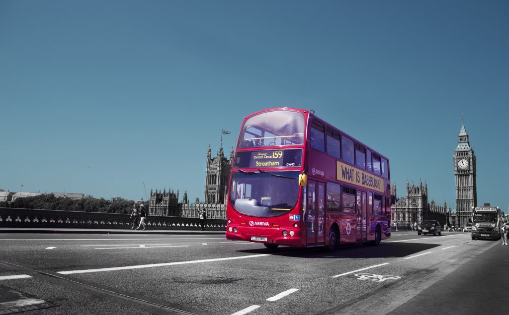
Another London icon recognized worldwide, the London Bus is a red double-decker bus, originally a rear-entrance AEC Routemaster. The red color was imposed in 1907, when operators were still using a variety of colors to indicate where the bus was going. The operator which introduced the red color was London General Omnibus Company, which chose this color to make its vehicles stand out from the crowd. By the time when London Transport was established as a single company, red was already the predominant color and it was decided for all buses to be red.
-
The London Underground logo
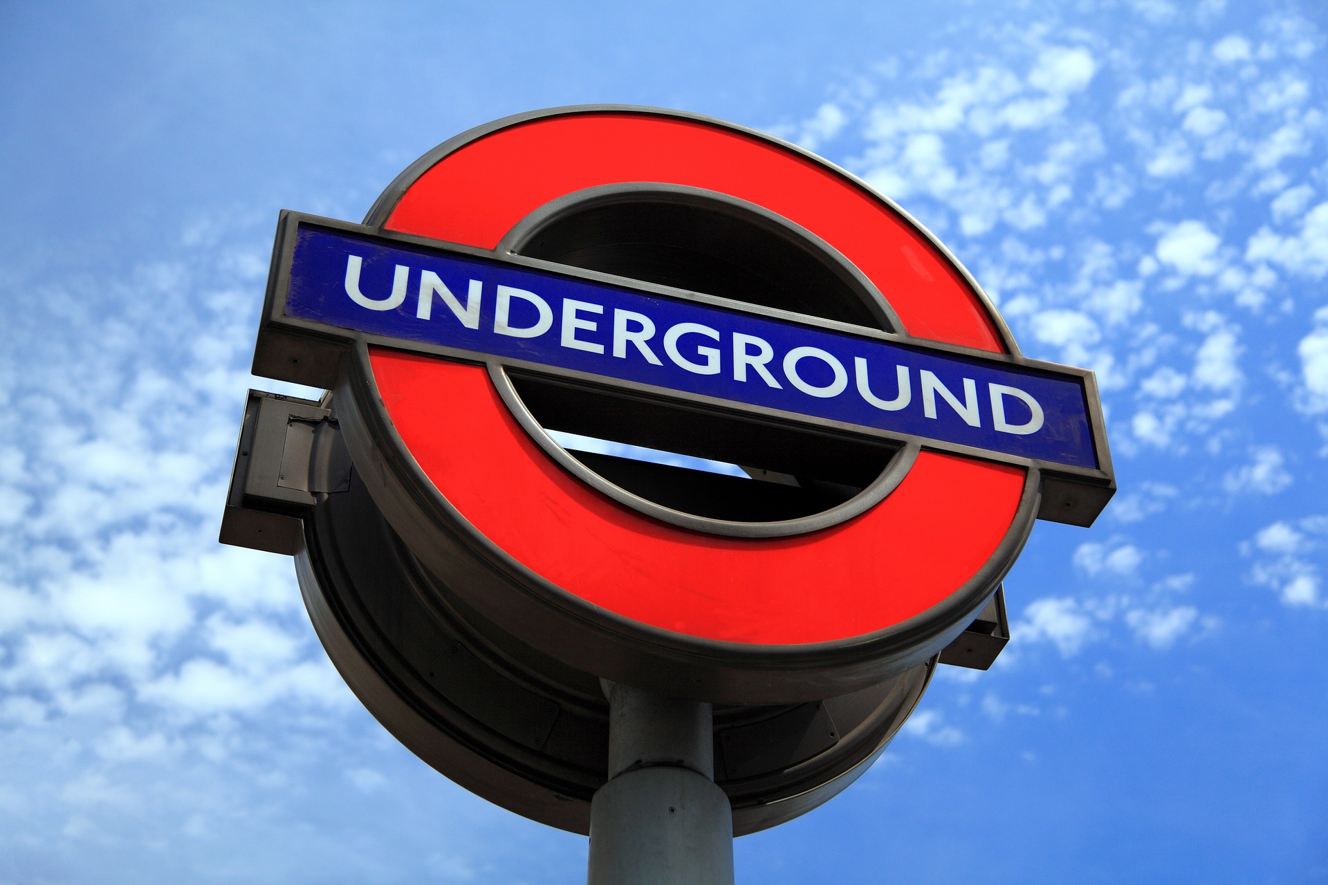
The London Tube logo, a bar-and-circle design introduced in 1908 is probably one of the best-known commercial transport logos. You will probably be disappointed to find out that the logo is not attributed to a certain artist, nor does it signify anything particular. However, its simplicity and memorable shape has enabled it to survive throughout multiple eras and end up symbolizing the city itself. Those who would like to learn more about the London Tube roundel will find the book A Logo for London by design historian Dr. David Lawrence very captivating.
-
The black cab
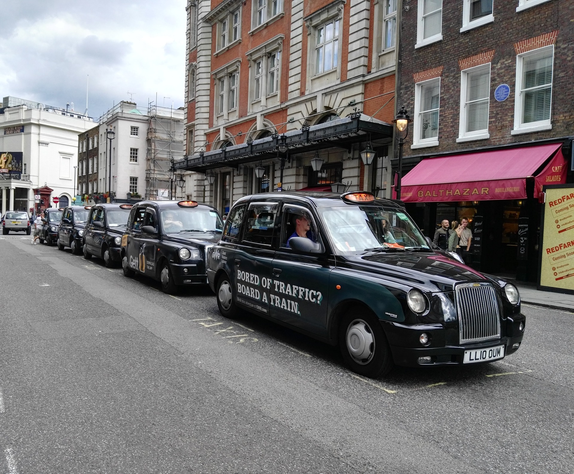
The black cab is manufactured by The London Taxi Company in Coventry, while cabs to be sold to the rest of the world are produced in Shanghai. Formerly known as The London Taxi Corporation Ltd., The London Electric Vehicle Company Ltd. changed its name in 2017 with the launch of the new TX electric taxi. In the past 60 years, over 130,000 London black cabs have been produced by this company, with production averaging between 2,000 and 2,500 units per year. Interesting fact: the oldest cab driver retired in 2007 at age 92 – Alfred Collins had been driving for 70 years.
These are just the most notable London icons; what else comes to your mind when you think about the capital of the United Kingdom?